-
You MUST read the Babiato Rules before making your first post otherwise you may get permanent warning points or a permanent Ban.
Our resources on Babiato Forum are CLEAN and SAFE. So you can use them for development and testing purposes. If your are on Windows and have an antivirus that alerts you about a possible infection: Know it's a false positive because all scripts are double checked by our experts. We advise you to add Babiato to trusted sites/sources or disable your antivirus momentarily while downloading a resource. "Enjoy your presence on Babiato"
Wovie - Movie and TV Series Streaming Platform v1.0.2
No permission to download
- Thread starter BlakenFist
- Start date
You are using an out of date browser. It may not display this or other websites correctly.
You should upgrade or use an alternative browser.
You should upgrade or use an alternative browser.
I wish I had the knowledge to fix itNo because thats where I store my videos I don't want people filling my storage up with trash that exists or some unrelated stuff, if you want to use my videos you can do using my APi.
@meyz unfortauntely I still have no idea why this doesn't work, due to it been such a small bug I've put very little time into fixing it, there's nothing stopping you trying to fix it though
you don't want the seasons and episodes section to show at all?
easiest way is to change the css to display none
/app/theme/assets/css/app.css
find
Code:
.app-detail .season-list {
  margin: 2rem 0;
  display: flex;
  flex-direction: row;
  max-width: 100%;
  max-height: 600px;
  overflow-y: auto;
  background-color: #101010;
  border-radius: 6px;
}
Code:
.app-detail .season-list {
  margin: 2rem 0;
  display: flex;
  flex-direction: row;
  max-width: 100%;
  max-height: 600px;
  overflow-y: auto;
  background-color: #101010;
  border-radius: 6px;
display: none;
}
find
Code:
@media (max-width: 767.98px) {
  .app-detail .season-list {
    background-color: transparent;
    flex-direction: column;
  }
Code:
@media (max-width: 767.98px) {
  .app-detail .season-list {
    background-color: transparent;
    flex-direction: column;
display: none;
}one slight issue I've noticed
when importing from tmdb because it's using the language code EN it imports all movies as country England
so I found that the issue is within
/app/controller/admin/Tmdb.php
but I don't know how to fix it
it's the 'original_language' bit that's messing it up but that's as far as I can get with it
ideas?
original_country or original_name doesn't work
when importing from tmdb because it's using the language code EN it imports all movies as country England
so I found that the issue is within
/app/controller/admin/Tmdb.php
Code:
                    // Country
                    $Country        = $this->db->from('countries')->where('language',mb_strtoupper($Listing['original_language'],"UTF-8"))->first();
$CreateYear = ($PostType == 'movie' ? explode('-',$Listing['release_date']) : explode('-',$Listing['first_air_date']));it's the 'original_language' bit that's messing it up but that's as far as I can get with it
ideas?
original_country or original_name doesn't work
one slight issue I've noticed
when importing from tmdb because it's using the language code EN it imports all movies as country England
so I found that the issue is within
/app/controller/admin/Tmdb.php
but I don't know how to fix itCode:// Country $Country = $this->db->from('countries')->where('language',mb_strtoupper($Listing['original_language'],"UTF-8"))->first(); $CreateYear = ($PostType == 'movie' ? explode('-',$Listing['release_date']) : explode('-',$Listing['first_air_date']));
it's the 'original_language' bit that's messing it up but that's as far as I can get with it
ideas?
original_country or original_name doesn't work
I don't understand the issue your trying to resolve ?
I don't understand the issue your trying to resolve ?
that code is importing the language as the country
Code:
$Country = $this->db->from('countries')->where('language',mb_strtoupper($Listing['original_language'],"UTF-8"))->first();when the country of origin should be United States
Attachments
Updated Wovie: Redux Auto Embed V1.0.1, fixed the API as I changed domain to a specific domain as opposed to been attached to Watch A Movie. I'll be making a major update in the next week or so which will combined auto embed and manual embed, if no manual embed then it auto embeds for you.
My search is working see:

hello, how can i fix search not working properly ?

My search is working see:

Attachments
Hello peoples, another update this one is a lot of rewrites of what I've already done. This is Wovie: Redux 2.0.0 which has both the base version of the website as well as the autoembed version of the website.
if embed link is empty then it automatically gets the link from my API and will automatically embed it
if download link is empty then it automatically gets the link from my API again.
you can mix and match and provide your own embed link for the video and still get my auto download link by leaving the download link empty and vice versa.
Added:
I still can't work out why everything uploaded is from England and I can't work out why some episodes don't have the next button. If I do find the fixes for these, they'll obviously be patched in.
If you want a different API other than mine adding in PM me it'll cost...
Download is attached, if it doesn't work then download it at https://cdn.watcha.movie
Installation Instructions:
if embed link is empty then it automatically gets the link from my API and will automatically embed it
if download link is empty then it automatically gets the link from my API again.
you can mix and match and provide your own embed link for the video and still get my auto download link by leaving the download link empty and vice versa.
Added:
- Manual Embeds
- {if no manual embed} Auto Embed
- Manual Downloads
- {if no manual downloads} Auto Embed Download Link
- Added RSS Feeds
- Movies
- Shows
- Episodes
- Added the ability to toggle RSS Feeds in settings
- Toggle ALL Feeds
- Toggle Movies
- Toggle Shows
- Toggle Episodes
I still can't work out why everything uploaded is from England and I can't work out why some episodes don't have the next button. If I do find the fixes for these, they'll obviously be patched in.
If you want a different API other than mine adding in PM me it'll cost...
Download is attached, if it doesn't work then download it at https://cdn.watcha.movie
Installation Instructions:
- Overwrite all the files apart from /app/config/db.config.php
- Remove install directory
- clear cache on Cloudflare
- done.
Attachments
looking it over, a few things
app\locale\en.php
there's a few duplicates of strings
I've attached the file without the duplicates
a personal preference so if others want to change it, the breadcrumb changing the - to a /
app\theme\assets\scss\bs\_nav.scs
find
change to
and in app\theme\assets\css\app.css
find
change to
and then to add Home to the breadcrumbs
in app\theme\view
in the following files
actor.php
channel.php
collection.php
discussion.php
episode.php
movie.php
serie.php
find
change to
on the slider move the title to the top and the imdb/year/type to below the title and change the imdb css a bit
also flipped the next and previous buttons around, makes more since to me to have the next on top and previous on bottom
i've attached the home.slider.php
it goes into
app/theme/view/module
and then in
app/theme/assets/css/app.css
find
change to
find
change to
if you want the next and previous buttons to always display (even on mobile and smaller screens)
still in the app.css
find and remove
and then to move the next and previous buttons on the slider over more
still in app.css
find
change to
feel free to change the right: 5px to whatever you want, I just pushed it over to the edge more
below are some fixes for some screen sizes (typically around 850 - 980px things get a bit messed up)
to fix the issue with the collections, notifications, and profile in the header so they aren't stacked on top of each other at some screen sizes and are all inline
still in app.css
find
change to
to fix the issue of the header menu being on multiple lines on some screensizes
still in app.css
find
change to
to fix the issue of the gap in the header on some screen sizes
still in app.css
find
change to
to fix the issue with the logo acting as the menu (which doesn't work if you click it, it briefly shows the drop down menu and then redirects you to the home page)
I couldn't really fix it, so I just removed it and pushed the logo to the right of the screen, also replaced the mobile hamburger menu with the site's hamburger menu so that it looks the same
I've attached the file header.php
it goes into
app/theme/view/common
here's a demo of the changes

I'll post some more later, been playing a lot with the layout and css but need to pick out what I feel is improvements over personal preferences
app\locale\en.php
there's a few duplicates of strings
Code:
'Pages'      => 'Pages',
'Hello'      => 'Hello',
'Country'      => 'Country',
'Sorting'      => 'Sorting',
'Comments'      => 'Comments',
'Your password has been sent to your e-mail address !'      => 'Your password has been sent to your e-mail address !',
'Removed'      => 'Removed',
'Code' => 'Code',
'Secret Key' => 'Secret Key',a personal preference so if others want to change it, the breadcrumb changing the - to a /
app\theme\assets\scss\bs\_nav.scs
find
Code:
content: '– ';
Code:
content: ' / ';find
Code:
.breadcrumb .breadcrumb-item + .breadcrumb-item:before {
  content: "– ";
  color: #9999a5 !important;
}
Code:
.breadcrumb .breadcrumb-item + .breadcrumb-item:before {
  content: " / ";
  color: #9999a5 !important;
}
and then to add Home to the breadcrumbs
in app\theme\view
in the following files
actor.php
channel.php
collection.php
discussion.php
episode.php
movie.php
serie.php
find
Code:
<li class="breadcrumb-item">
Code:
<li class="breadcrumb-item"><a href="<?php echo APP;?>"><?php echo __('Home');?></a></li><li class="breadcrumb-item">on the slider move the title to the top and the imdb/year/type to below the title and change the imdb css a bit
also flipped the next and previous buttons around, makes more since to me to have the next on top and previous on bottom
i've attached the home.slider.php
it goes into
app/theme/view/module
and then in
app/theme/assets/css/app.css
find
Code:
.app-slider .slide .slide-caption .imdb {
  font-size: 12px;
  font-weight: 500;
  color: #ffc526 !important;
}
Code:
.app-slider .slide .slide-caption .imdb {
background: #ffc526;
border-radius: .25rem;
padding: 3px 6px;
margin-right: 20px;
color: #000;
text-shadow: none;
font-size: .9em;
display: inline;
}
Code:
.app-slider .slide .slide-caption .slide-header > div {
  color: rgba(255, 255, 255, 0.6);
  margin-right: 10px;
}
Code:
.app-slider .slide .slide-caption .slide-header > div {
margin-right: 10px;
}
if you want the next and previous buttons to always display (even on mobile and smaller screens)
still in the app.css
find and remove
Code:
  .app-slider .carousel-control {
    display: none;
}still in app.css
find
Code:
.app-slider .carousel-control {
  position: absolute;
  top: 50%;
  right: 50px;
  transform: translateY(-50%);
  display: flex;
  flex-direction: column;
  z-index: 10;
}
Code:
.app-slider .carousel-control {
  position: absolute;
  top: 50%;
  right: 5px;
  transform: translateY(-50%);
  display: flex;
  flex-direction: column;
  z-index: 10;
}below are some fixes for some screen sizes (typically around 850 - 980px things get a bit messed up)
to fix the issue with the collections, notifications, and profile in the header so they aren't stacked on top of each other at some screen sizes and are all inline
still in app.css
find
Code:
.navbar-nav {
  display: flex;
  flex-direction: column;
  padding-left: 0;
  margin-bottom: 0;
  list-style: none;
}
Code:
.navbar-nav {
  display: flex;
  flex-direction: -webkit-inline-box;
  padding-left: 0;
  margin-bottom: 0;
  list-style: none;
}
to fix the issue of the header menu being on multiple lines on some screensizes
still in app.css
find
Code:
.navbar {
  position: relative;
  display: flex;
  flex-wrap: wrap;
  align-items: center;
  justify-content: space-between;
  padding: 0.5rem 1rem;
}
Code:
.navbar {
  position: relative;
  display: flex;
  align-items: center;
  justify-content: space-between;
  padding: 0.5rem 1rem;
}
to fix the issue of the gap in the header on some screen sizes
still in app.css
find
Code:
@media (max-width: 991.98px) {
  .app .app-wrapper {
    display: block;
  }
}
Code:
@media (max-width: 991.98px) {
  .app .app-wrapper {
    display: inline-flex;
  }
}
to fix the issue with the logo acting as the menu (which doesn't work if you click it, it briefly shows the drop down menu and then redirects you to the home page)
I couldn't really fix it, so I just removed it and pushed the logo to the right of the screen, also replaced the mobile hamburger menu with the site's hamburger menu so that it looks the same
I've attached the file header.php
it goes into
app/theme/view/common
here's a demo of the changes

I'll post some more later, been playing a lot with the layout and css but need to pick out what I feel is improvements over personal preferences
Attachments
Last edited:
just to make sure, there were no db changes to this? all just file changes?Hello peoples, another update this one is a lot of rewrites of what I've already done. This is Wovie: Redux 2.0.0 which has both the base version of the website as well as the autoembed version of the website.
if embed link is empty then it automatically gets the link from my API and will automatically embed it
if download link is empty then it automatically gets the link from my API again.
you can mix and match and provide your own embed link for the video and still get my auto download link by leaving the download link empty and vice versa.
Added:
- Manual Embeds
- {if no manual embed} Auto Embed
- Manual Downloads
- {if no manual downloads} Auto Embed Download Link
- Added RSS Feeds
- Movies
- Shows
- Episodes
- Added the ability to toggle RSS Feeds in settings
- Toggle ALL Feeds
- Toggle Movies
- Toggle Shows
- Toggle Episodes
I still can't work out why everything uploaded is from England and I can't work out why some episodes don't have the next button. If I do find the fixes for these, they'll obviously be patched in.
If you want a different API other than mine adding in PM me it'll cost...
Download is attached, if it doesn't work then download it at https://cdn.watcha.movie
Installation Instructions:
- Overwrite all the files apart from /app/config/db.config.php
- Remove install directory
- clear cache on Cloudflare
- done.
just to make sure, there were no db changes to this? all just file changes?
Correct no database changes, there's a database string change, but that changes when you toggle the setting not a manual database change.
In the changes you've made what was the problem with the logo ? why is it over on the right now ?
If you view the site at around 850px to 980px or soCorrect no database changes, there's a database string change, but that changes when you toggle the setting not a manual database change.
In the changes you've made what was the problem with the logo ? why is it over on the right now ?
the logo replaces the menu hamburger
the problem is that it doesn't actually work
if you click the logo (which is now the menu drop down icon instead of the hamburger)
it shows the menu for a split second (depending on fast your site loads) and then kicks you to the homepage instead of being the menu
I tend to work on my computer with split screens and so my screen is usually around 955px or so
at this screen size a few things get wonky (as mentioned above)
the main issue is that the menu doesn't work, the logo replaces the hamburger menu but if you click on it, it redirects you to the homepage
the only way I could "fix" this was to just remove the logo from the menu code and then I threw it over to the right so that the logo was still there but not messing up the menu.
If you view the site at around 850px to 980px or so
the logo replaces the menu hamburger
the problem is that it doesn't actually work
if you click the logo (which is now the menu drop down icon instead of the hamburger)
it shows the menu for a split second (depending on fast your site loads) and then kicks you to the homepage instead of being the menu
I tend to work on my computer with split screens and so my screen is usually around 955px or so
at this screen size a few things get wonky (as mentioned above)
the main issue is that the menu doesn't work, the logo replaces the hamburger menu but if you click on it, it redirects you to the homepage
the only way I could "fix" this was to just remove the logo from the menu code and then I threw it over to the right so that the logo was still there but not messing up the menu.
Okay thanks for letting me know, I'll work on re-working the "tablet" size as the mobile and the desktop versions are obviously fine.
another slight issue...if a series has a lot of seasons
it runs off the width of the page
app/theme/assets/app.css
find
change to
find
change to
find
change to
though I'm not sure how well this will hold up to something that has a lot more seasons

it runs off the width of the page
app/theme/assets/app.css
find
Code:
.app-detail .season-list {
margin: 2rem 0;
display: flex;
flex-direction: row;
max-width: 100%;
max-height: 600px;
overflow-y: auto;
background-color: #101010;
border-radius: 6px;}
Code:
.app-detail .season-list {
margin: 2rem 0;
display: flex;
flex-direction: row;
overflow-wrap: anywhere;
max-width: 100%;
max-height: 600px;
overflow-y: auto;
background-color: #101010;
border-radius: 6px;}
find
Code:
.app-detail .season-list .seasons .nav a {
padding: 15px 20px !important;
display: block;
text-align: center;}
Code:
.app-detail .season-list .seasons .nav a {
padding: 15px 20px !important;
display: table-footer-group;
text-align: center;}
find
Code:
.app-detail .season-list .seasons .nav {
flex-wrap: nowrap;
overflow-x: auto;}
Code:
.app-detail .season-list .seasons .nav {
flex-wrap: nowrap;
overflow-x: auto;
padding: 15px 20px;}
though I'm not sure how well this will hold up to something that has a lot more seasons

another slight issue...if a series has a lot of seasons
it runs off the width of the page
app/theme/assets/app.css
find
change toCode:.app-detail .season-list { margin: 2rem 0; display: flex; flex-direction: row; max-width: 100%; max-height: 600px; overflow-y: auto; background-color: #101010; border-radius: 6px;}
Code:.app-detail .season-list { margin: 2rem 0; display: flex; flex-direction: row; overflow-wrap: anywhere; max-width: 100%; max-height: 600px; overflow-y: auto; background-color: #101010; border-radius: 6px;}
find
change toCode:.app-detail .season-list .seasons .nav a { padding: 15px 20px !important; display: block; text-align: center;}
Code:.app-detail .season-list .seasons .nav a { padding: 15px 20px !important; display: table-footer-group; text-align: center;}
find
change toCode:.app-detail .season-list .seasons .nav { flex-wrap: nowrap; overflow-x: auto;}
Code:.app-detail .season-list .seasons .nav { flex-wrap: nowrap; overflow-x: auto; padding: 15px 20px;}
though I'm not sure how well this will hold up to something that has a lot more seasons

By default it should scroll I think some CSS you've changed might of fucked it because look at mine
Test it here: https://watcha.movie/serie/the-walking-dead-571

I mean, it does scroll but it throws the layout off and pushes everything outside of the screen size including the title image
lol guess it's just my ocd
lol guess it's just my ocd
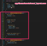
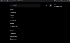
@Shadav This might help you with the tablet size. I remove the logo entirely and did a few re-organization based on Titan latest upload.
@Titan sorry for hijacking your work. Thank you for your tremendous effort. Loads of people are benefiting from this including myself. I am editing it for my own use as well, if all are good I will be migrating existing site to this template. I will be editing quite a lot of it on top of your wonderful work. I don't know if you wanted to collaborate, if you don't mind we can all share same code base through Github and you can push it to the people here.
STEPS:

DO NOT FORGET TO COMPILE YOUR SASS
Results:

@Titan sorry for hijacking your work. Thank you for your tremendous effort. Loads of people are benefiting from this including myself. I am editing it for my own use as well, if all are good I will be migrating existing site to this template. I will be editing quite a lot of it on top of your wonderful work. I don't know if you wanted to collaborate, if you don't mind we can all share same code base through Github and you can push it to the people here.
STEPS:
CSS:
@include media-breakpoint-down(md) {
  .app-navbar {
    display: none;
  }
  .header-search {
    width: unset;
    flex: 1;
    .app-search {
      width: 100%;
      margin-left: unset;
    }
  }
  .navbar-nav.navbar-user {
    flex-direction: row;
  }
}
DO NOT FORGET TO COMPILE YOUR SASS
Results:

to get the scroll to top to display on smaller screen sizes
app/theme/assets/js/app.js
find
change to whatever size you want I went with 200
so now the scroll to top shows up on mobile and tablet
app/theme/assets/js/app.js
find
Code:
if ($(window).width() > 1000) {
Code:
if ($(window).width() > 200) {Similar threads
- Replies
- 4
- Views
- 307
- Replies
- 0
- Views
- 639
- Replies
- 17
- Views
- 2K
- Replies
- 119
- Views
- 13K


